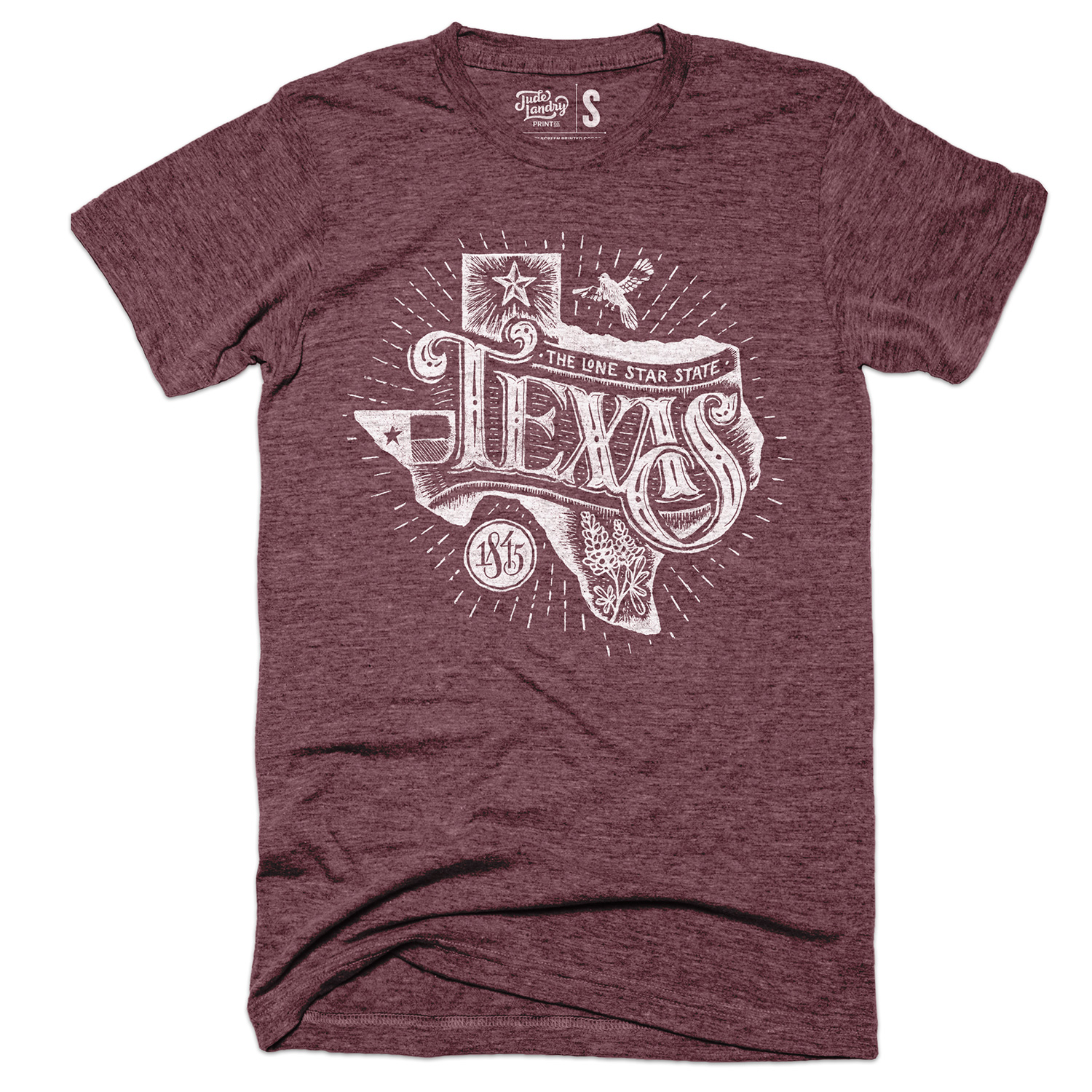
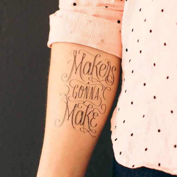
Jude Landry is a designer and professor at UNT's College of Visual Arts & Design. He specializes in lettering, illustration, and - oh yeah - screen printing. In fact, in the short few years that he's lived here he has made what is arguable the most popular Denton T-shirt design of all time - the "Oh No You Denton" shirt that you've no doubt seen or own or are wearing right now (it's at least in the top three). He also just happened to the be person we went to when we wanted some help with adjusting our brand. Last week, we launched our new look complete with logo design by Landry. Read on to find a little bit more about one of Denton's best designers including his thoughts on the City of Denton Flag (hint: he doesn't like it much), "designy illustration," and why Metallica is the best music to listen to when screen printing.
WDDI: Hey Jude! Can you tell us a little bit about yourself? (i.e. what do you do? what brought you to denton? etc…) This will be used in an intro for the piece.
Landry: I’m a graphic designer who specializes in lettering, illustration, and screen printing. I am married to Alisha, and together we have three children—Joan, Charlotte, and Simon.
WDDI: How did you end up at UNT?
Landry: I was working as a professor at Mississippi State University but saw an opening at UNT. Though I had never been to Denton and didn’t know anyone here, the Communication Design program had an excellent reputation. I sent in an application, and after two rounds of interviews, I was offered the job. I moved here in the summer of 2014 and started working that fall as an Assistant Professor in Communication Design.
In what ways does Denton influence your work?
If you’re a creative person you can’t help but be influenced by the place you live and work. Denton is a city that celebrates creativity, and that’s great for an artist like myself. I’m very grateful to have been embraced by the community. When I create art that celebrates Denton in some way, that art becomes a part of the narrative that Denton is a great place. If people think of Denton as a great place, they will want to live here, work here, and hopefully contribute to the city in a positive way.
We recently listened to an episode of the 99% Invisible Podcast about city flags and it really made us look at them in a different light. As a graphic artist, what are your thoughts on the City of Denton’s flag?
You can probably see why Landry has issues with the City of Denton Flag.
The Denton flag is a pretty weak piece of design in my opinion. It’s sort of a flag within a flag, with bad type. It seems redundant to have the Texas state flag repeated within the Denton flag. I listened to that episode, and I think the biggest issue with the flag design is having the word “Denton” on it. It creates a problem because flags have to be viewed from both sides, so the type is backwards when looking at it from one direction. A flag, like a logo, could be almost anything, though. It takes time and repetition to build recognition and ultimately, brand loyalty.
Walk us through some of the process of designing our new logo.
The first order of business with the new WDDI logo was to address some technical challenges. The previous logo was good but it didn’t hold up at small sizes for social media icons. The type was stacked vertically, but sometimes the logo needed to fit in a more horizontal space. I decided a system of logos would function better than one, single logo. The system is simple: words in boxes that could be arranged differently depending on the application. I also thought using the initials for smaller applications would read better. If you think the logo is boring, I would agree! The target logo is boring, the apple logo is boring. I intentionally avoided trying to be trendy, because that can make work look dated within a few years. The logo is meant to adapt and change over time. I envision layering it over photographs and other graphics. It can be changed to any color and still work. Other boxes with symbols or icons can also be attached to it. With time and good use, I think it will function well.
What’s the story behind the famous “Oh No You Denton” shirt?
The “Oh No You Denton” shirt came out of a discussion I was having with my wife, Alisha. When we decided to move to here, we were trying to figure out the proper way to pronounce “Denton.” That “t” in the middle of the word forces your mouth to stumble if you keep the hard “t”. Most people kind of skip over the “t” and say “Den’n”—it’s just easier. Well, I thought “Den’n” sounded like slang for “Didn’t”, and I just said, “Oh no you Denton!” I knew it would make a great t-shirt, that people would get a kick out of the play on words. I never could have imagined just how popular it has become. We Denton Do It uses the same play on words, but we arrived at the shirt idea before ever having seen the blog!
Sure, Jude. Sure... Anyway, we hear that you have a habit listening to death metal while you screen print alone in a hot dorm room. Any truth to that?
I’m not sure where you would have heard this rumor! I don’t actually listen to Death Metal, but I do love hard rock and metal. I like to put on Tool, Metallica, Silverchair, or Alice in Chains when I’m printing. Those are the bands I fell in love with when I was a teenager learning how to play the guitar. Screen printing can be very boring, repetitious work. If I start to think too much about how I have to push ink through a screen several hundred times, I can drive myself crazy. Listening to music allows me to zone out and helps to pass the time.
We checked out your work at UNT on the Square recently and loved it. How would you describe your style of design?
An illustrator I follow and admire named Mikey Burton describes his illustration style as “designy illustration,” and I think that’s a pretty good description of my own style. I’m like a lot of graphic designers who sort of dabble in illustration, but don’t quite have the skills of more polished, traditional fine artists and illustrators. Designy Illustration probably means it’s a bit clean and geometric, with simple shapes. More than any one particular style, I want my work to be known as being thoughtful. Before I ever actually make anything, I’ll spend a lot of time thinking about whether it’s even worth my time. I try to come up with concepts that will drive the meaning and visuals behind the art. I never intentionally set out to create a recognizable style that would come to be associated with my name. Over the last five years, perhaps a bit of a “style” has emerged due to the limitations of screen printing. I love using a grid to create order. I usually use no more than three colors. I keep all of my artwork within a border, too. I can’t screen print to the edge of the paper due to the size of my screens. These limitations have created some similarities in my prints.
What’s your favorite form of printing?
I love screen printing, and it’s the only printing method that I’m really familiar with. I took a printmaking class in college where I learned intaglio, and I’m familiar with letterpress printing, but screen printing is what I love to do. You don’t need too much gear to do it, either. For posters, you need screens big enough to fit the artwork on, with a mesh count of about 200 to 250. Get some screen hinge clamps and a large, smooth, hard piece of board to print on, and you’re good to go.
What's an aspect of bad design that you see in everyday life that bugs you?
It’s funny, because there isn’t that much that bothers me anymore. When I first started learning about design, all of the bad signs and billboards I would see really rubbed me the wrong way. My eyes were opened and I suddenly realized that there are a lot of people with bad taste out there. Over time though, I didn’t want to be negatively affected by it all the time. I just sort of accept it as a part of being a designer. The thing that bothers me the most is when I see what I would consider to be the wrong typeface for the wrong application. A designer has to be educated on typefaces—their history, influences, and best uses. Typefaces don’t typically come with an instruction manual, so many people use them poorly. Design isn’t as easy as it looks!
You're also a Communication Design professor at UNT. What sets UNT’s College of Visual Arts & Design apart from others?
UNT’s Communication Design program is the most rigorous one I have ever seen. Part of that rigor emerges out of the high number of students who want to be in the program and the limited number of spaces we have available each year. There are typically 150 freshmen who apply to be in the program, but after two rounds of portfolio reviews, we can only accept 40 each year. That competition for a spot means only the best and brightest get in. The faculty at UNT are extremely intelligent, talented, and hardworking. We have high standards for our students, and our students often meet those high standards through their hard work and dedication to excellence.
When I was at Mississippi State University, I gave my students an assignment where they had to design a label for a wine bottle. They each bought a bottle of wine to use for the project, and would bring it to class so we could look at the shape and color of the bottle, and talk about how they might create an appropriate label. I was critiquing while holding the bottle and I accidentally hit it against a small ledge. The bottle broke and the entire bottle of red wine spilled out onto the carpet! I couldn’t stop laughing at the absurdity of the moment.
Thanks, Jude!
You can find plenty of t-shirts and prints currently available on Landry's website for purchase. He says we can expect a few new designs a little down the road so keep an eye out for those.


